
Always design ‘for print’’.
A valuable lesson I learnt 20 years ago was making sure your designs can be printed successfully.
It’s fine making something look pretty on screen, but what about when it’s printed? I’ve summarised some areas to consider below, and I’ll go into more detail individually over coming posts:
Spacing – keep all content well in from the crop lines
Colours – make sure the bright colours you’ve chosen recreate well in CMYK as you may have chosen RGB colours on screen
Bleed – make sure you bleed all items off (that need it) at least 3mm as best practise
Gutter – be mindful of how the pages will fold if it’s a brochure, nudge text to the left or right away from the gutter zone
Finishing – if it’s to be PUR bound or saddle stitched, make sure you’ve allowed for the loss of paper that goes into the binding
Glitches – keep an eye out for cropped bitmaps in front of vectors. Sometimes they pixelate when PDF’d
Registration – make sure all text is out of one plate (like black) or registration is difficult for the printers on thin fonts and you risk seeing a coloured blurry font
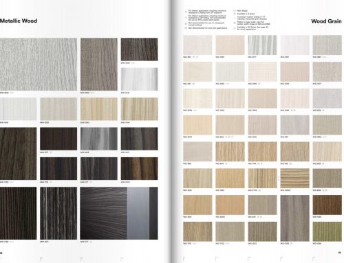
Resolution – generally bitmaps print best around 300dpi, so always check the resolution in InDesign before exporting


Leave A Comment